Lillie Thomasset
May–June 2025

Motivation
The topics of this project stem from my interest in design from my studies as a Creative Technology & Design major, and my interest in art museum spaces as a consumer/visitor.
When I was thinking about this project, I had a very vague idea about what I wanted to do. My research question was,
"How do modern/contemporary and traditional art museums design their exhibit space in order to improve engagement with their displays?”
That is the question I went into my fieldwork with.
As I conducted my fieldwork, my motivation and inspiration was influenced by the data I was collecting.
Now, after ideating, collecting data, and creating some design sketches, I have landed on a more specific question:
“How can technology intervene with the art museum visitor experience in a way that enhances engagement with both modern/contemporary and traditional art?”

Background
Literature and Design Space Review
Through my research, I decided to focus my fieldwork on the Tate Modern Museum and the National Gallery in London, UK.
A majority of the reading I did was about the design, curation, and construction of art museum/gallery spaces.

Boggs, J. S. (1985). The Designing of a National Gallery.
This journal was about the creation of the National Gallery in Ottawa, Canada.
I found it very interesting because it mentioned the difference in priorities between architects and gallery curators.
For example, the use of natural light was very conflicting as some architects love natural light and some don’t. The issue here is that pure natural light damages artwork, but a lack of natural light can feel claustrophobic. This helped me gain a perspective on light and its uses in a gallery setting.

The Tate Modern
They put a lot of effort into defamiliarizing what visitors are used to seeing at an art museum by forcing a new perspective on art.
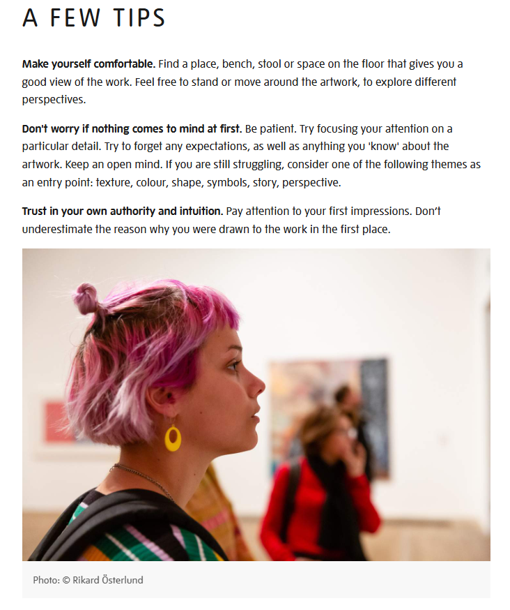
I found this to also be true from looking at Tate Modern’s website where they have a publicly accessible, free article called, “A guide to slow looking.”

websites
I looked into the websites of the Tate Modern and National Gallery and compared their pre-visit services.
The Tate Modern’s resources were not only easier to find, but had a lot more helpful information than the National Gallery.
The National Gallery has more advertisements for their social media, and other services right on their front page.
The Tate Modern links directly to helpful articles about accessibility, family spaces, and the guide to slow looking.

Fieldwork
In the National Gallery and Tate Modern, I focused on three categories: large rooms, small rooms, and “standout” rooms.

This image is a map of the second floor of the National Gallery, London.
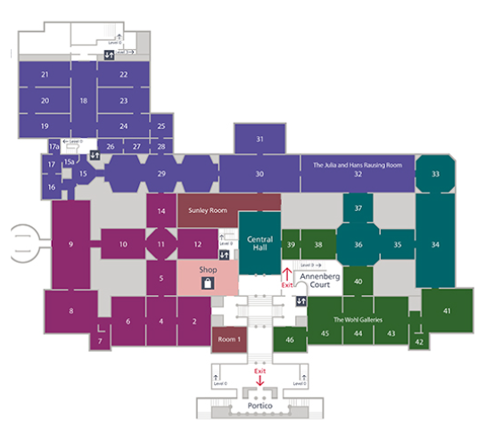
This image is a map of the second floor of the Tate Modern in London.
When going about observing these spaces, I observed the left half of the National Gallery's map and the entirety of the Tate Modern's map.

Large Rooms
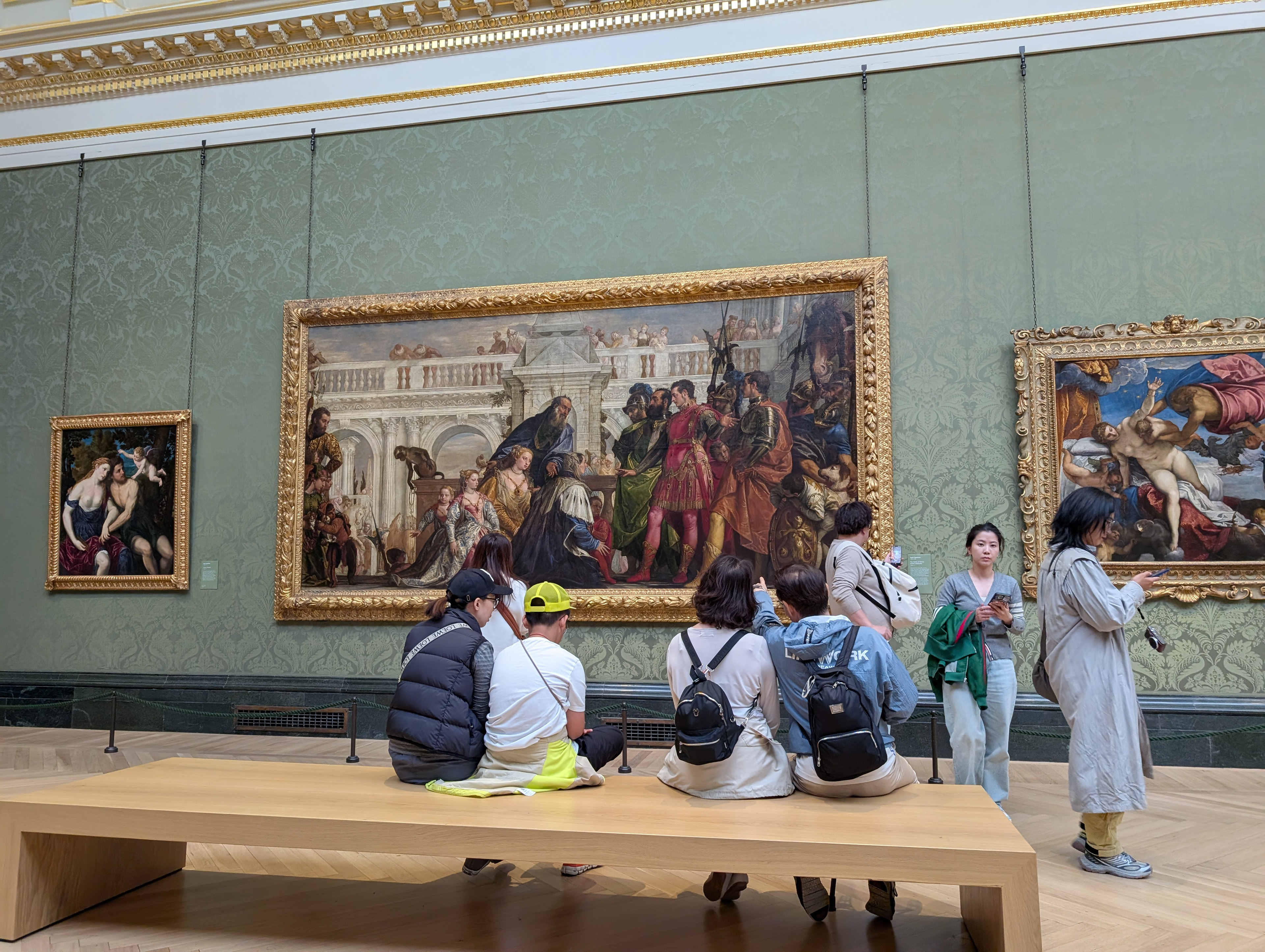
National Gallery, Room 9.
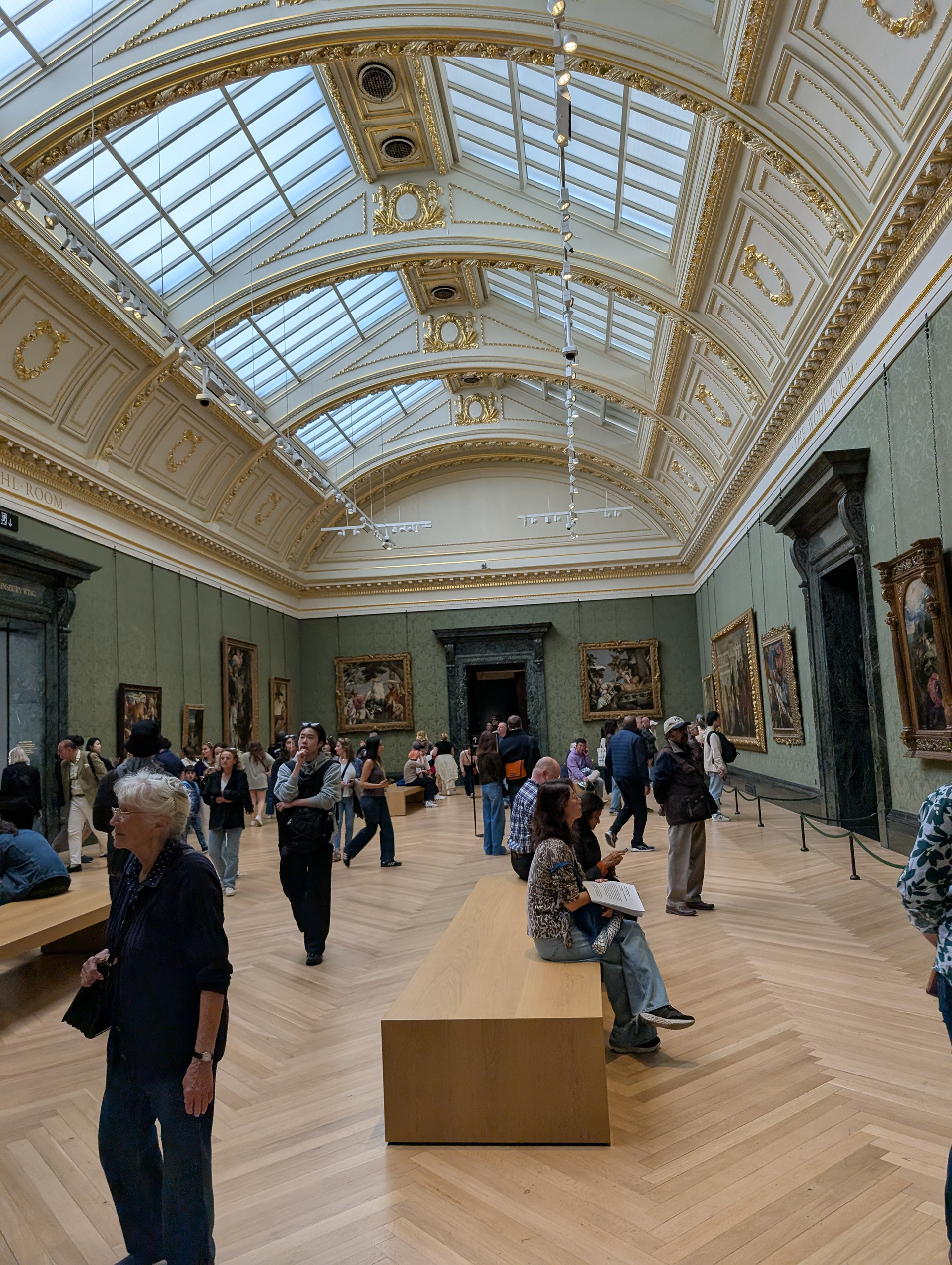
Key takeaways:
- There is a constant stream of people going in and out.
- The paintings are very large.
- There is a very high ceiling.
- There are a variety of different people.
- A person taking pictures of a painting = spends less time looking at the painting.
- A person sitting in front of a painting = spends more time looking at the painting.
- A person standing in front of paintings = spends less time looking at paintings.
- A person listening to audio guide = spends more time looking at paintings.
- Distractions: phones, Air Pods, children crying, loud footsteps.
Analysis:
The architecture of this room makes this space a combination of a gallery room and a hallway. There are people looking at the paintings and people just walking through. The paintings in this room are very large, which is why the ceiling is so high. A high ceiling with (controlled) natural light has a grand quality to it that is supposed to impress the visitor. Overall, a very flashy, impressive room.
—
I noticed something interesting in how people engaged with the art. When people were taking pictures they were often standing, when people were standing they were often wandering, not committing to a single painting. Those people didn’t spend a lot of time looking at the art. Meanwhile, people sitting and/or listening to audio guides tended to look at a singular piece of art for a significant amount of time. The people who looked at a piece of art the longest were sitting AND listening to an audio guide.
—
For some reason, footsteps were really loud in this room. I kept finding myself being distracted and overwhelmed by how surprisingly loud footsteps were in comparison to speech.
The Bench Bias
There was something really interesting to me about room 9. The fact that the benches were placed very specifically in front of certain, large, paintings. This had me wondering if the bias for these specific paintings (due to the benches) was purposefully done so that visitors would end up preferring those paintings, or are those benches placed there because those paintings are popular?

Tate Modern, room 6 – In The Studio
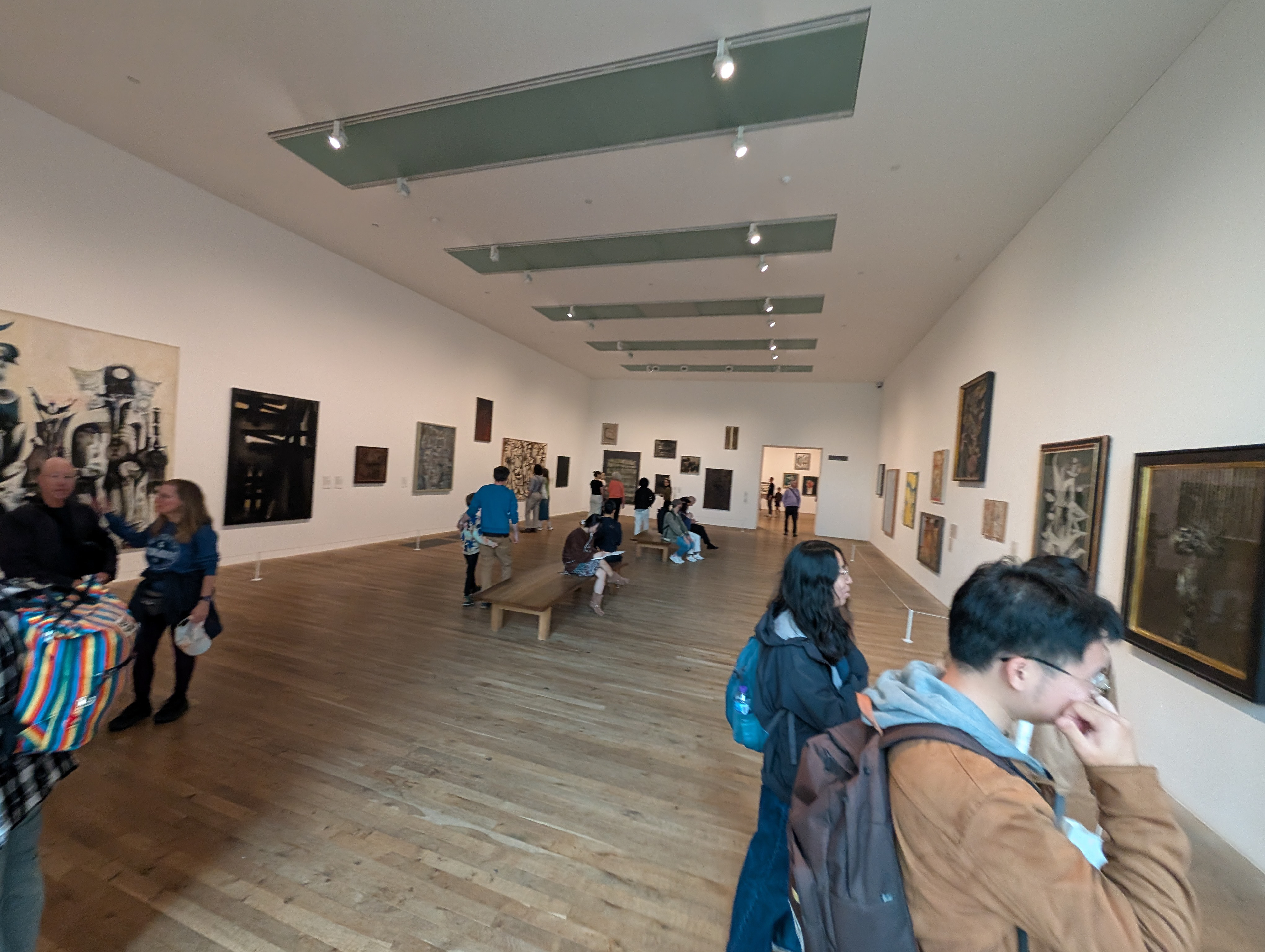
Key takeaways:
- This room is very spacious.
- Less people sitting. (Less seating.)
- People are sitting and drawing.
- Is there a bench bias?
analysis:
The room has a lot less foot traffic and there are less people, causing the extra space to feel bigger. There is less seating so there are only a few people sitting and a good portion of them are drawing. The benches aren’t placed directly in front of any particular artwork because of how much space there is. Due to this there is a lack of hierarchy and bias when it comes to displaying the artwork.
Now, notice how the art placement is different between the National Gallery and Tate Modern.
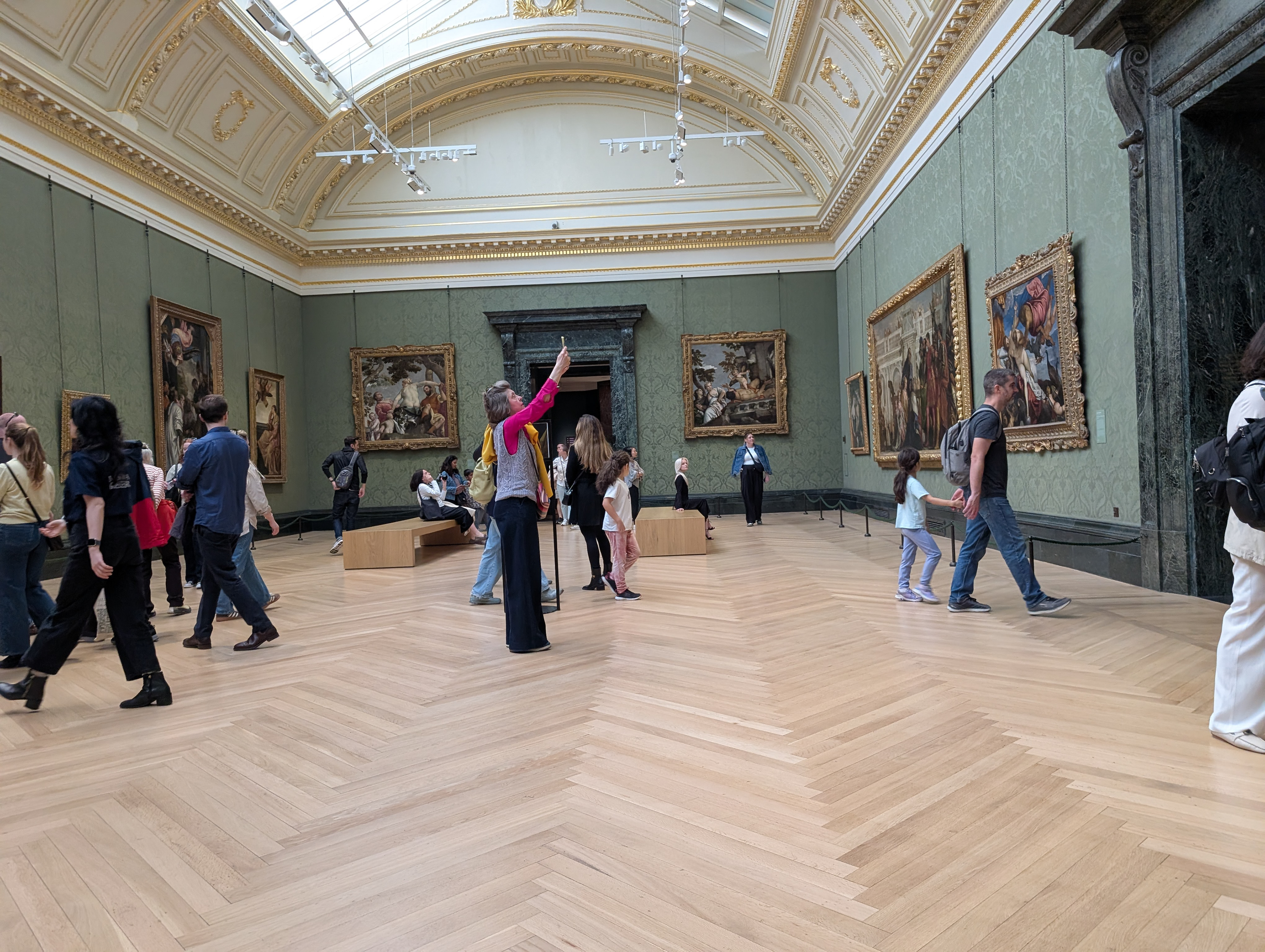
National Gallery, Room 9.
Tate Modern, Room 6 – In The Studio.

Small Rooms
National Gallery, room 7.
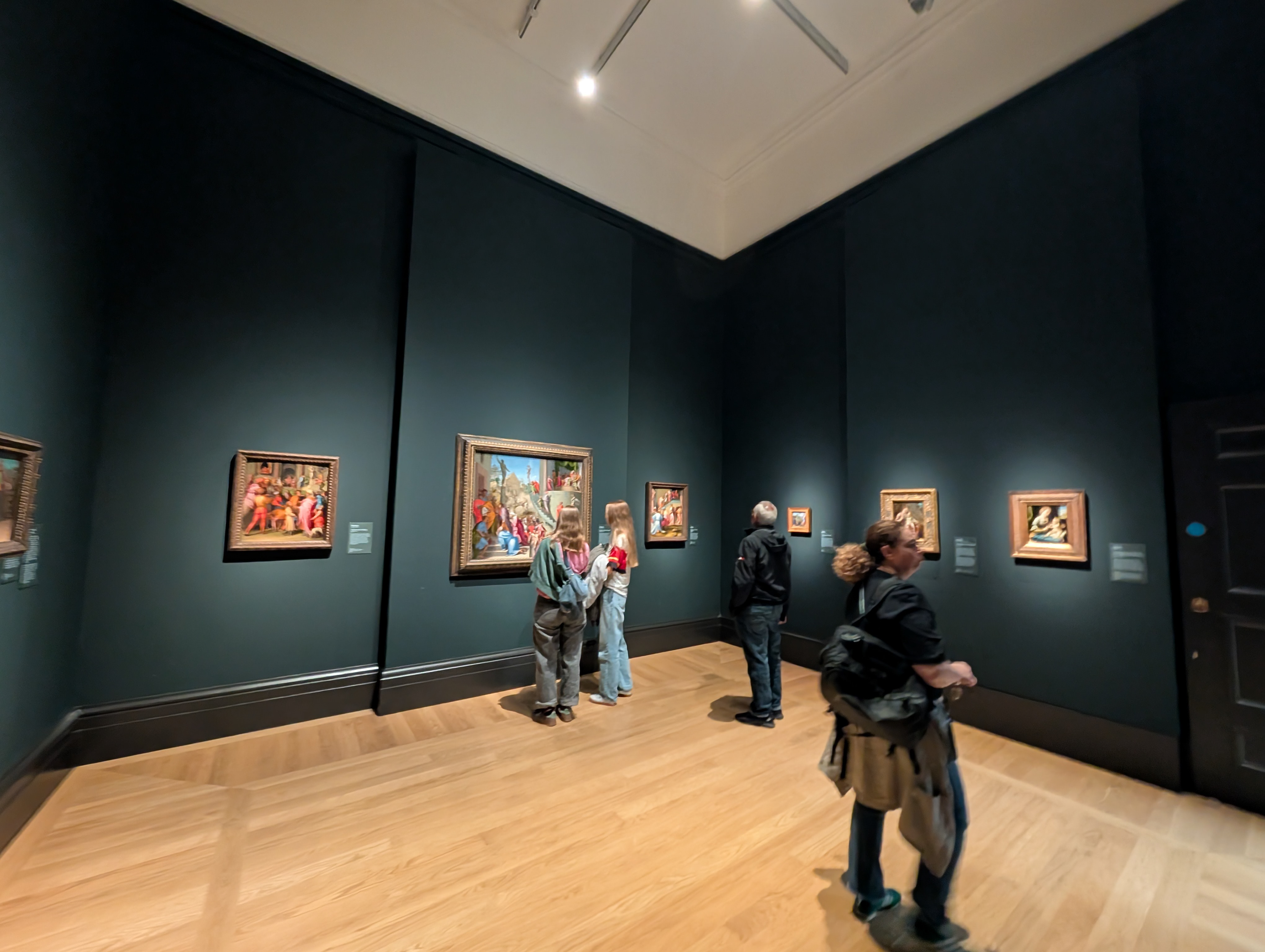
key takeaways:
- The room is small and dark.
- The art is clearly spotlighted.
- The ceiling is lower.
- There is no natural light.
- People have their phones out less.
- People aren’t taking photos.
- People are reading the plaques more.
- Nobody listening to an audio tour is in here.
analysis:
The walls physically being darker than room 9, along with the room physically being smaller, the lights being dimmer, the ceiling being lower, and the art being smaller all create a more intimate feeling.
—
People tend to talk quieter in places like these because everyone can hear each other’s conversations in this room. Something about the intimate setting with the art being so close to the visitor helps engage them more. Phones are out a lot less as a result. I find that people read the plaques a lot more and tend to skip looking at paintings a lot less here. Something that contributes to the encouragement of intimate engagement in this room is that audio tours don’t go into it. There is less foot traffic and so the people who are there get to appreciate the art without all of the distractions of room 9.

Tate Moder, room 3 – In The Studio.
key takeaways:
- The displays are very small.
- There are no benches.
- People are leaning in to look at the art.
- Movement throughout this space is easy.
analysis:
Similar to room 7 in the National Gallery, this room encourages an intimate feeling in different ways. The National Gallery has smaller rooms than the Tate Modern does, however, this room is smaller than the others and portrays the same intimate feeling as room 7. They don’t do this with low ceilings or dark walls, but with very small art that you have to lean just a couple inches away from in order to see everything. The movement through this space is straight forward and there is no seating as you can’t see the images from far away anyways. (For accessibility purposes, there is a separate room off to the right of the photo that has chairs for people to sit in.)

“Standout” Rooms
National Gallery, room 17a.
key takeaways:
- The smallest room that I visited in the National Gallery.
- The only room I saw with a 3D display.
- There is a low ceiling.
- People were very engaged with the 3D display.
analysis:
It surprised me that the smallest room that I visited was the only room with a 3D display. In this room there were also paintings but the room was so small that people could barely fit in order to take turns looking at the 3D display, never mind the painting. The low ceiling and small space created almost too intimate of an environment, it was much too crowded and I found it to be difficult to get in and out of this room. People were very interested in the 3D display; however, this room was so small that it was either forcing people to look at the display one-at-a-time or the curators didn’t think this 3D display would be popular.

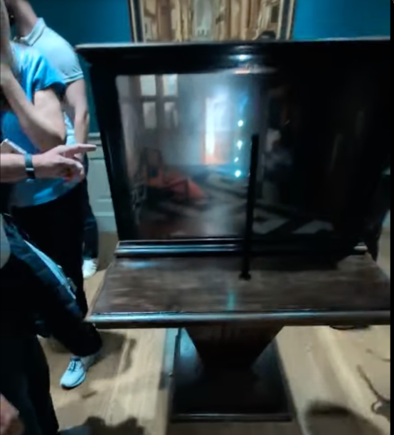
Tate Modern, Room 9 – Artists & Society.
key takeaways:
- It has a unique layout.
- It’s a gallery about a film.
- There’s an outer room that’s simple, holds room for thought.
- The inner room is a theater that is dark and engaging. (photo)
- The design is simple and effective.
- Visitors were confused about if they were allowed to enter the theater.
- There were multiple content warnings before entering the theater.
analysis:
There is a hallway around this theater that is completely white except for sentences like; “It’s easy to be in bed all day” and “The world I want is filled with ease.” All in black text with the same sans-serif font. This leaves the viewer with plenty of room for interpretation. The text itself gives the viewer nothing, which is the point of the mental exercise this gallery room is forcing the viewer to participate in. This design is very effective because of its simplicity. Although, the design may have been so simple that visitors were confused about if they were allowed to enter the theater because there was no clear signage that the dark hallway offshoot was a theater.
Unlike a lot of traditional art museums, this art came with content warnings.

Sketches
Ideation/Breadth Sketches
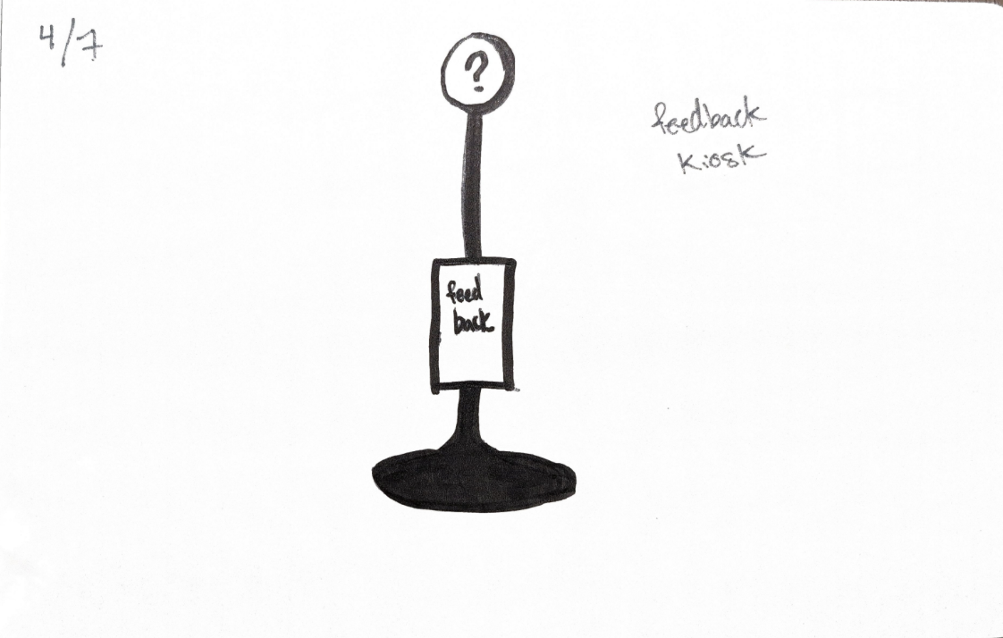
I heard a few people complaining about being lost, confused, or wanting more seating in certain areas of the museums.
So I thought... wouldn't it be interesting to have a service available where museum visitors can give feedback to the museum while they're IN the museum?
This would entail a sort of electronic, walk up booth that has a large question mark (?) or exclamation point (!) signifying it's a place to add feedback. The feedback would be given on the screen and, for accessibility purposes, there would be a version of this with a person at a kiosk (inspired by the information kiosks at the Tate Modern).

This drawing portrays a GPS app on a necklace that functions as google maps for the floorplan of the museum.
I got this idea because I kept getting lost in the National Gallery's second floor.
(Refer to the floorplan displayed earlier.)
So, what if there was an easy navigation system specific to the museum's floorplan?
The reason why the GPS is in the form of a necklace is because it reduces phone use in the galleries.
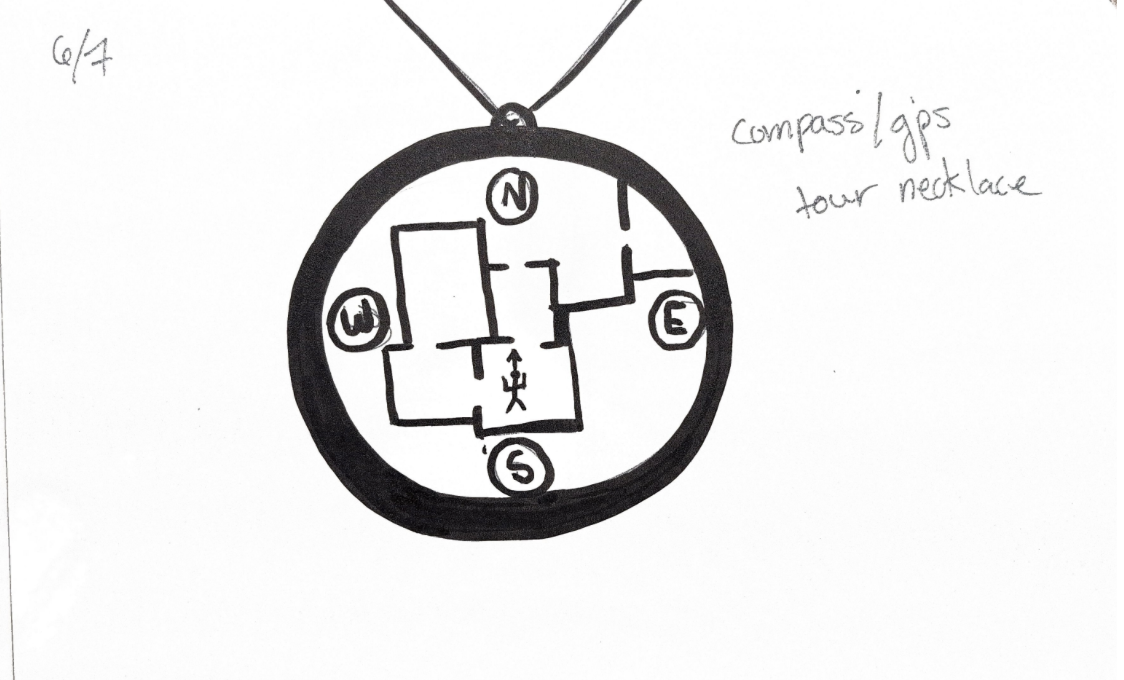

The biggest distraction that impeded on visitors' ability to engage with the galleries I went to were phones.
As it would be extreme to not allow phones in a museum gallery I wondered if we could find a solution by embracing phone use.
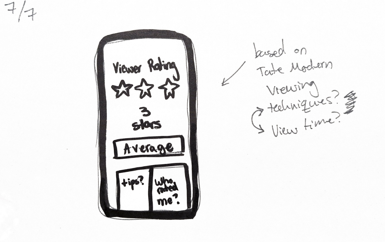
This thought process eventually led me to the idea of gamifying phone use in a gallery.
What if we were able to get a group of art critics and/or ethnographers to come up with guidelines defining what behaviors are positively and negatively impacting a person's engagement with a gallery?
Would making good museum behavior a competition encourage visitors to mindfully view artwork instead of speed through a gallery?

Depth Comics/Sketches
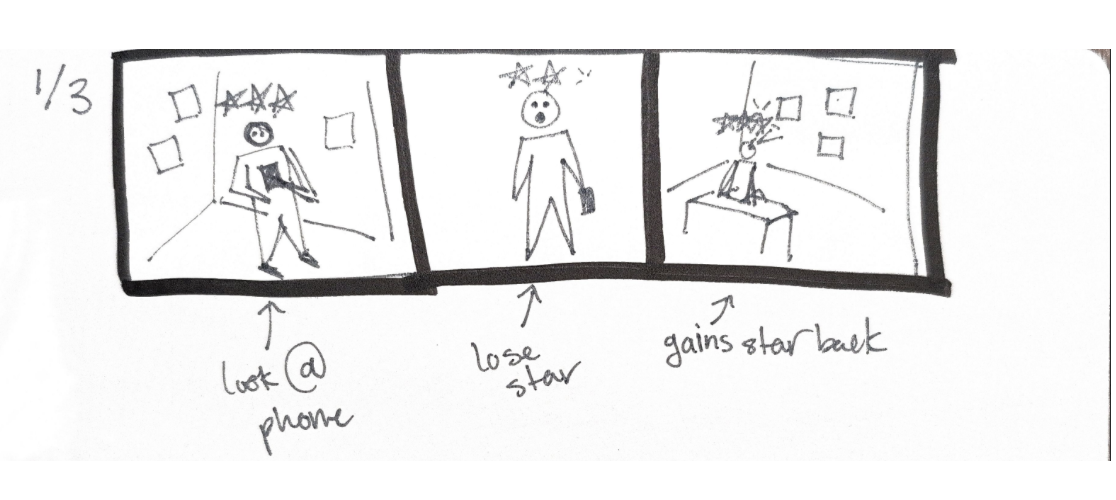
The Idea that really stuck with me was the idea of getting rated based on your art viewing habits/behaviors. The idea is that the visitor downloads an app that tracks their points/stars and whenever the visitor goes on their phone in a gallery, they start losing points.

Then, what about the opposite?
How can I behaviorally incentivize visitors to look at their phones in places other than the galleries?
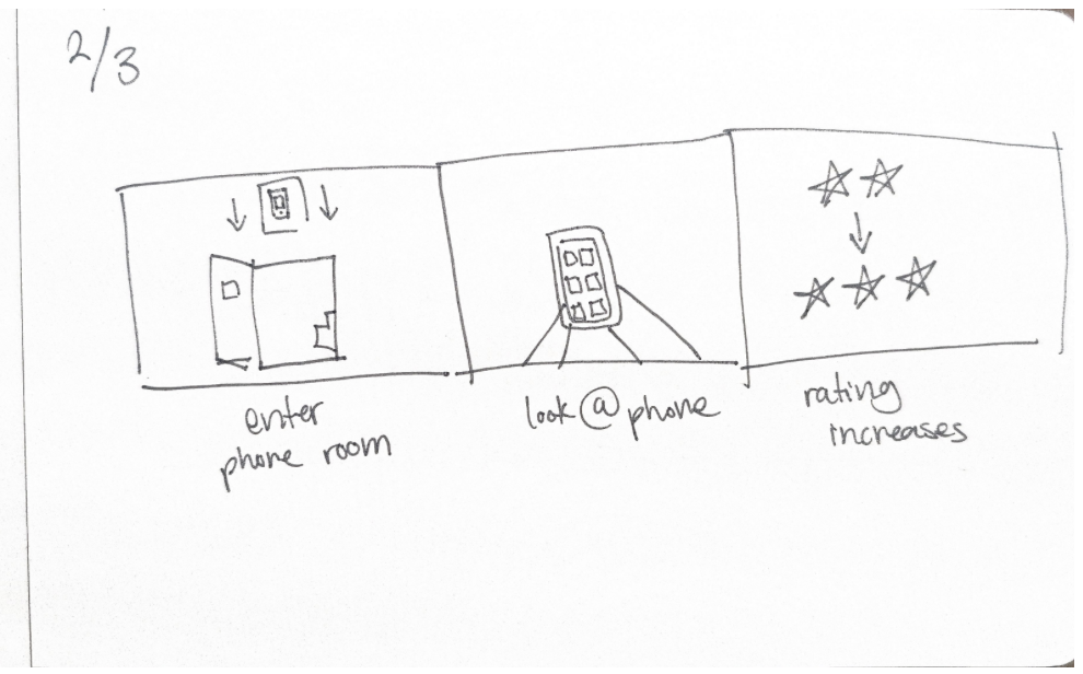
Then I thought of phone rooms! When a visitor enters one of these rooms and looks at their phone, they get some sort of reward for looking at their phone in that room rather than a gallery.
This way, visitors would be encouraged to look at their phones in the assigned phone rooms and decrease their phone use in the galleries. Then, ideally, this would decrease overall phone usage in museum galleries!

My Takeaways
Because of the short span of this project (3 weeks) I have a lot I would like to expand on and do differently.
For one, I would have loved to have more time in each museum, observing visitors on different days, at different hours. I also would have loved to get a lot more specific data, categorize rooms, possibly come up with another design that defines what an ideal gallery looks like.
Mainly, if I had more time I would go deeper into the design and development of my app. I would create a prototype and display its use as an engagement tool within art museums.
I have learned so much throughout this process and I am really happy that I got to branch out in this way. I have never done fieldwork before and now I know how I can improve my data-collection abilities going forward.